
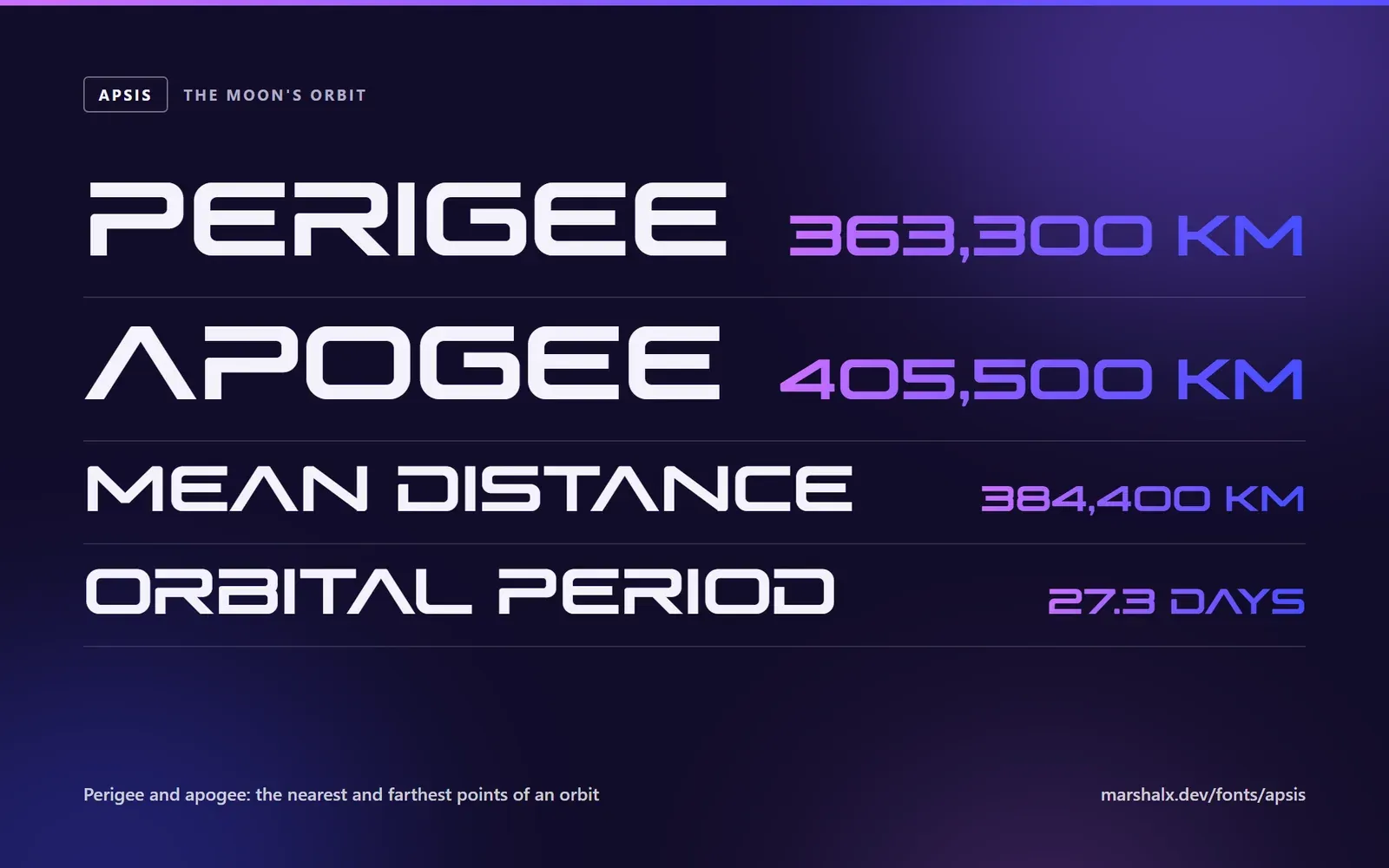
Apsis is a typeface for type set big: headlines, logos, game and film titles, the name on a splash screen. It went on sale today. This is what went into it, and why it looks the way it does.
Wide and square
An Apsis capital is about as wide as it is tall. The bowls of B, D, O and P are rounded rectangles rather than circles, with generous corners outside and tight ones inside, so a corner looks cut, not bent. Every stroke ends flat: the A has no point at its top, the V none at its foot, and the diagonals of K, X and Y are cut level where they meet the top or the baseline.
Width changes how a face is used. Apsis needs a smaller size than a regular sans for the same line, and it needs room: tracking it tighter only makes the letters collide.
Capitals first
The lower case is there, and it is unusually tall: the x-height is 78 % of the capital height. That keeps a lower-case word as strong as a capital one, but in a mixed-case sentence the small letters read as smaller capitals. So Apsis is a capitals face first. For a word or two, the lower case gives a softer voice in the same shapes.
218 characters
Apsis covers every character of Windows-1252: English, French, German, Spanish, Portuguese, Italian, Dutch, Danish, Norwegian, Swedish, Icelandic and Finnish.
Accents are where a display face often falls apart, so they got their own rules. A mark is lighter than a letter, about two-thirds of a stem, so it never competes with the word. It sits the same small distance above every letter, the gap the face already leaves under the dot of the i. Over I and i the marks are narrower, so they do not reach into the letter beside them. Æ and Œ share a stem between their two halves instead of setting two letters side by side, and ß is a stem and a 3, so it can never be mistaken for a B.
Spaced pair by pair
Every pair of letters that needs it is kerned, more than six thousand pairs in all. The accented letters were checked against the letters they are built on, so ÉV sits exactly as EV does, and where a mark reaches past its letter, as the dots of ï do, the pair is opened up just enough. A word with accents should look as finished as a word without.
Getting it
Apsis comes as OTF and TTF to install on Windows, macOS or Linux, and WOFF2 and WOFF for websites. A Standard licence covers one person or company on up to five computers, print, logos and their own websites; an Extended licence covers a whole company, plus apps, games and templates. You pay once, in your own currency, and every later version of Apsis 1 is included.
Every character is on the Apsis page, set in Apsis itself, so you can see exactly what you are buying.